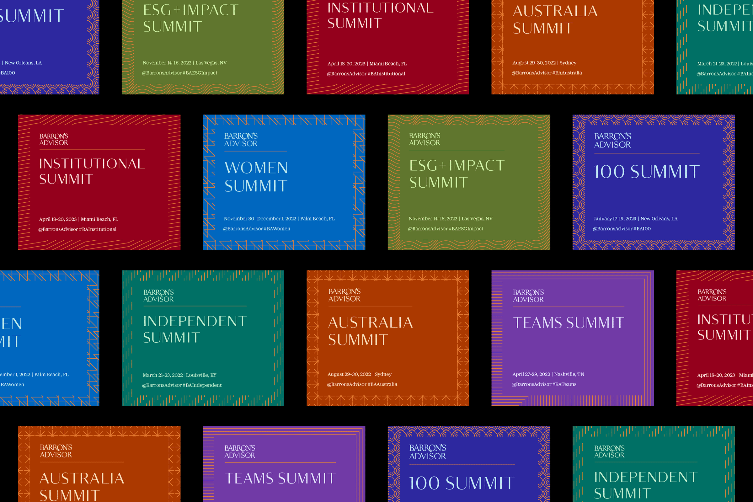
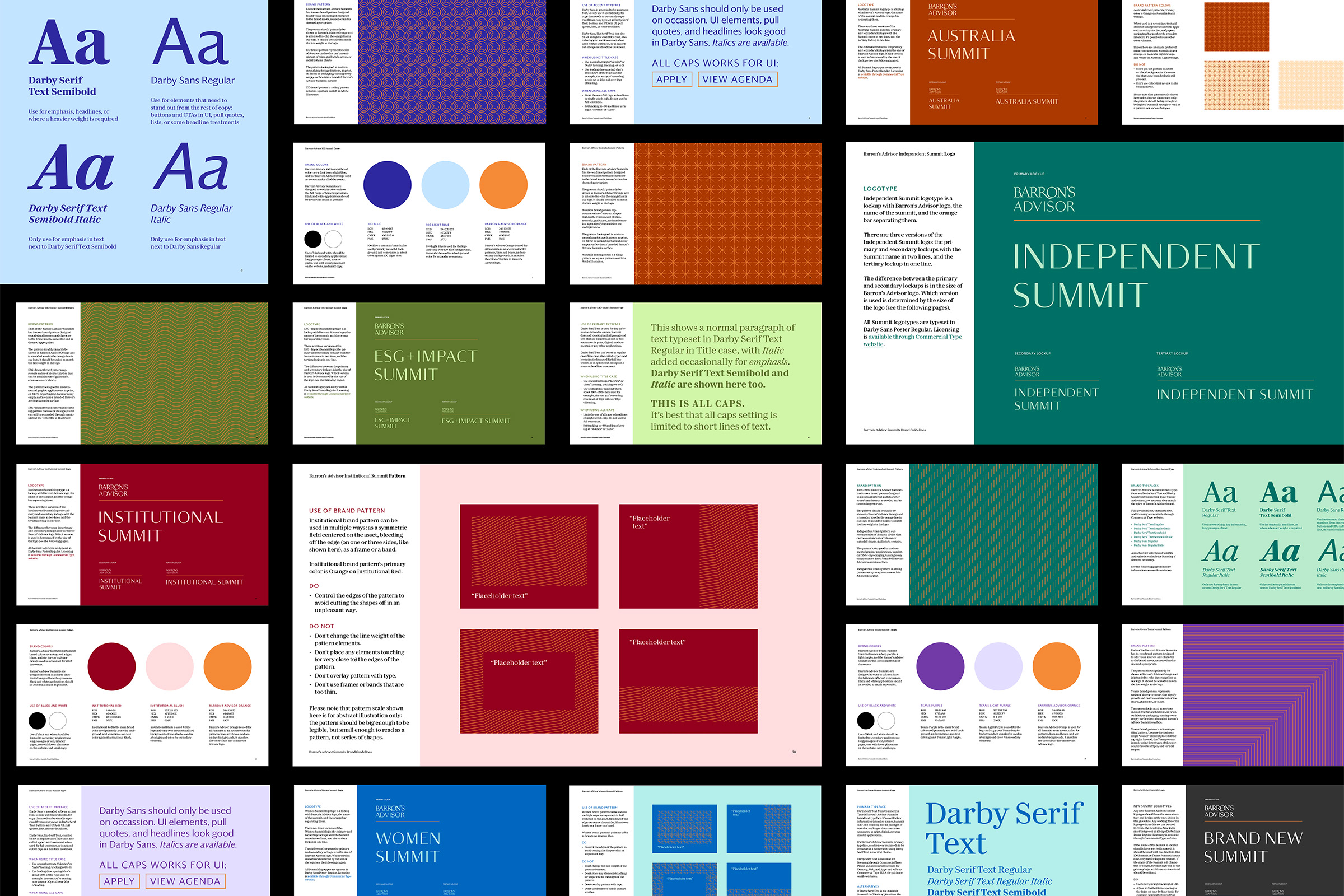
Barron’s Advisor Summits brand identities
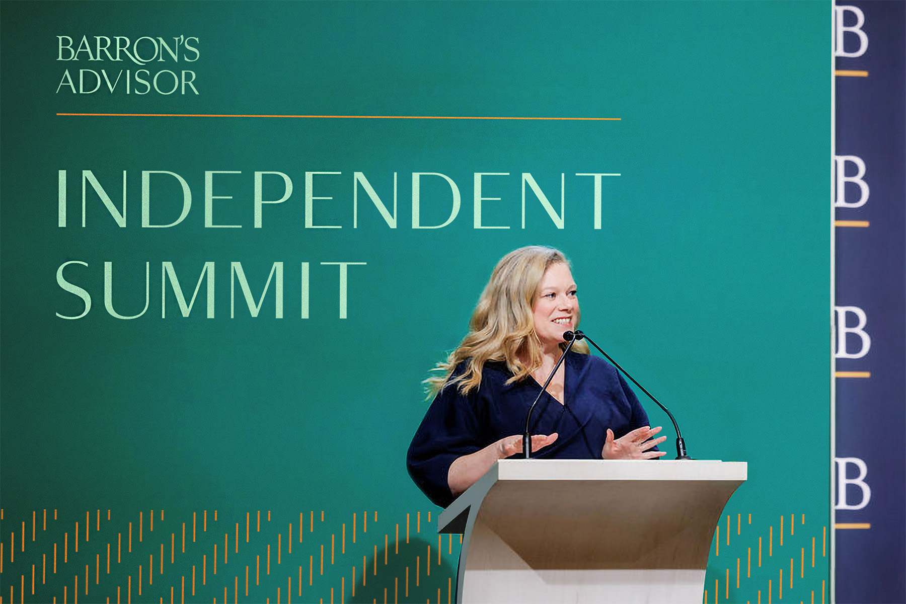
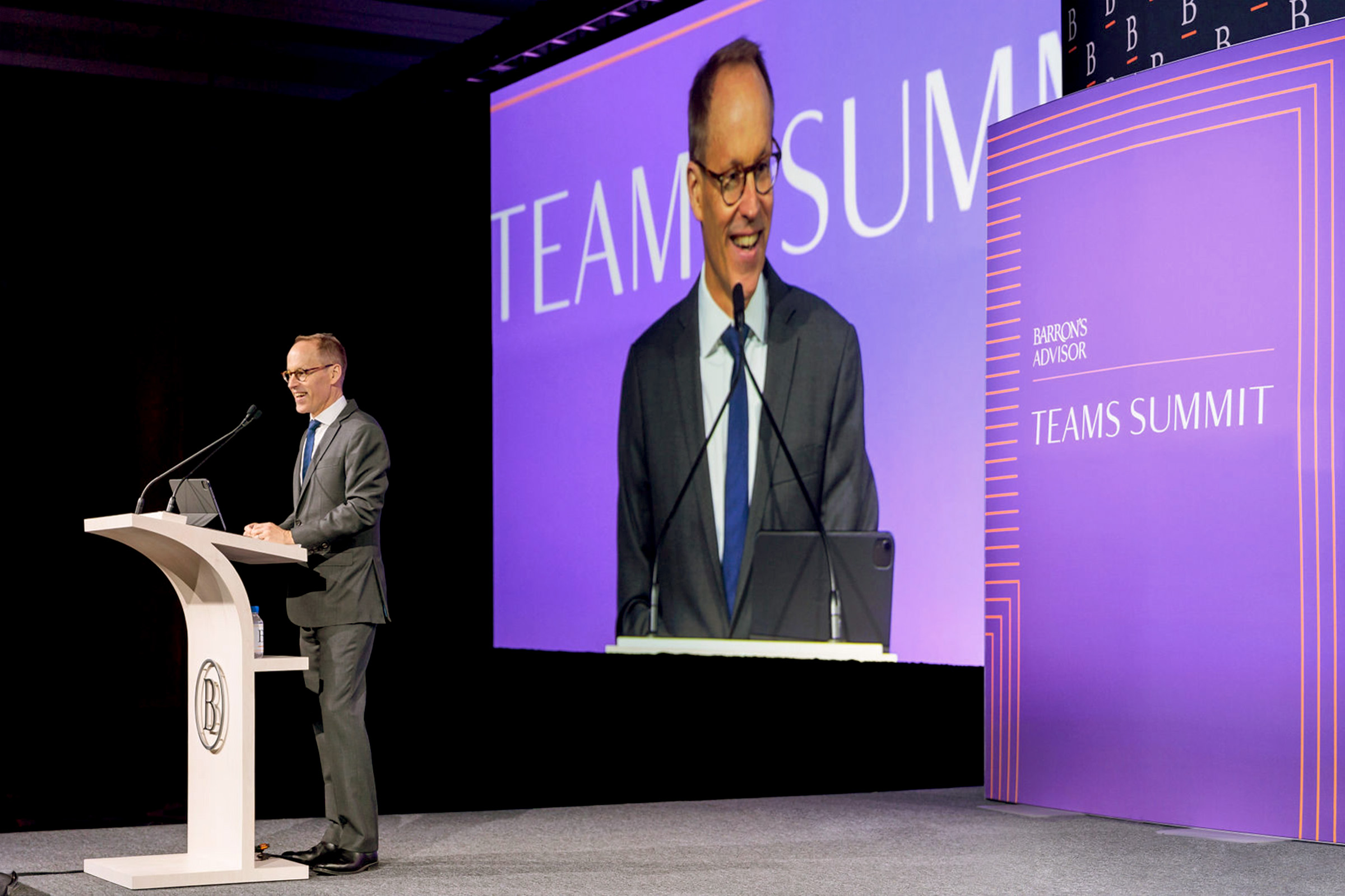
Barron’s Advisor Summits are an international event series hosted by Barron’s, a weekly investing magazine published by Dow Jones & Company. First introduced in 2005, the Summits are held annually or bi-annually and are attended by financial advisors and wealth management professionals across the English-speaking world — from Los Angeles in the U.S. to Sydney in Australia. In 2021 Barron’s team asked me to systematize the Summits’ brand language and develop brand identities for the events’ series.
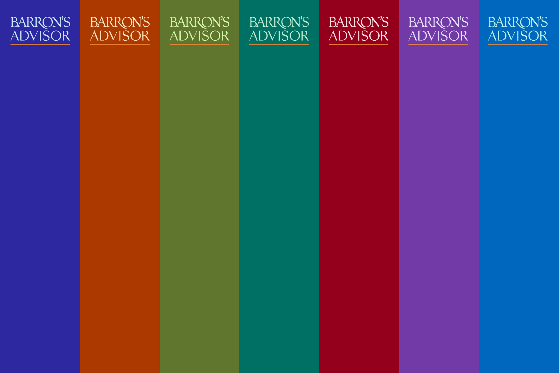
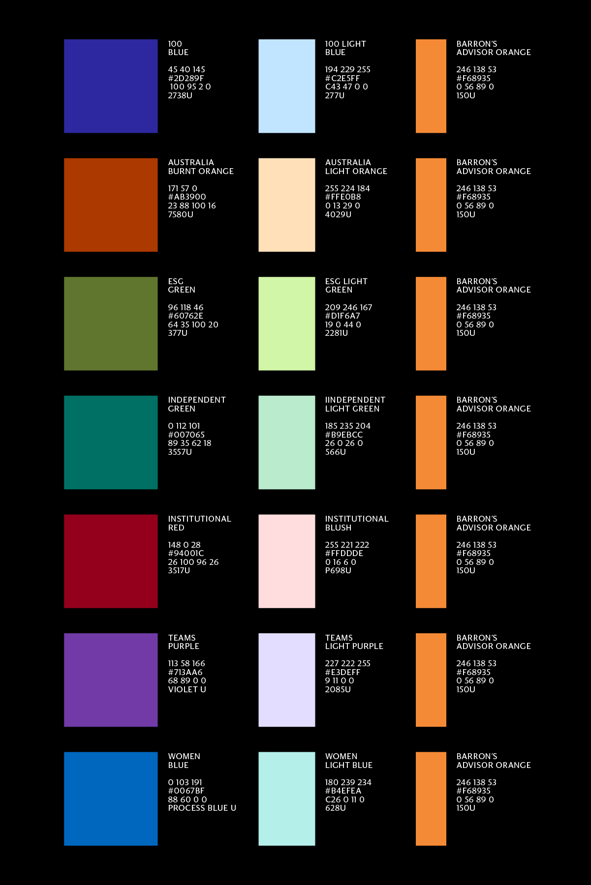
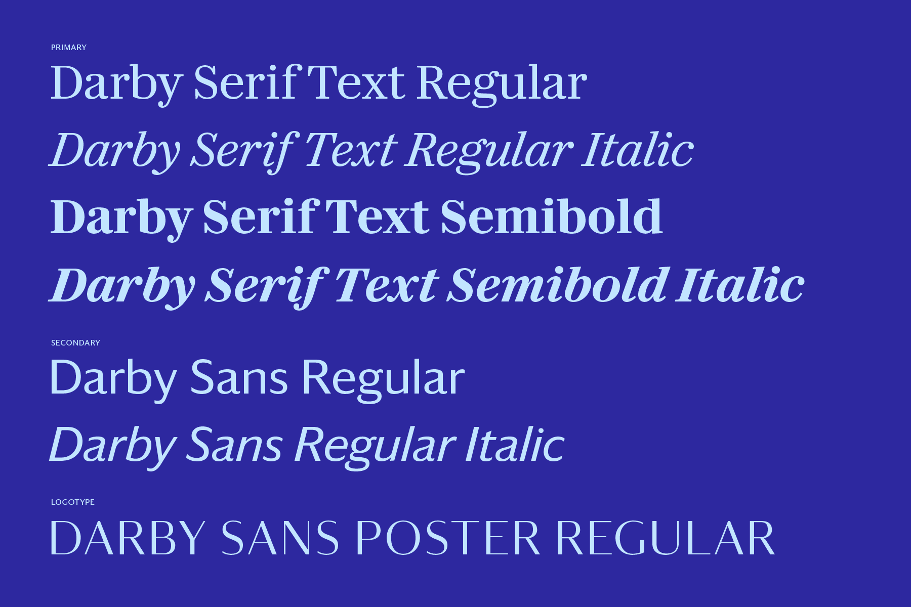
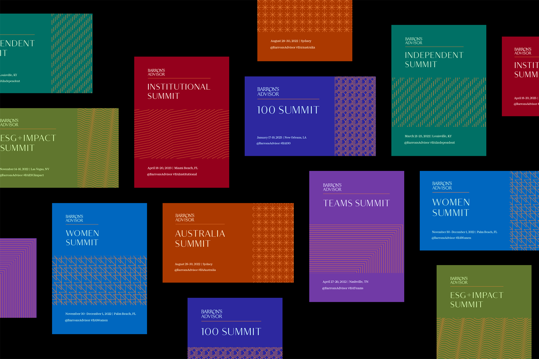
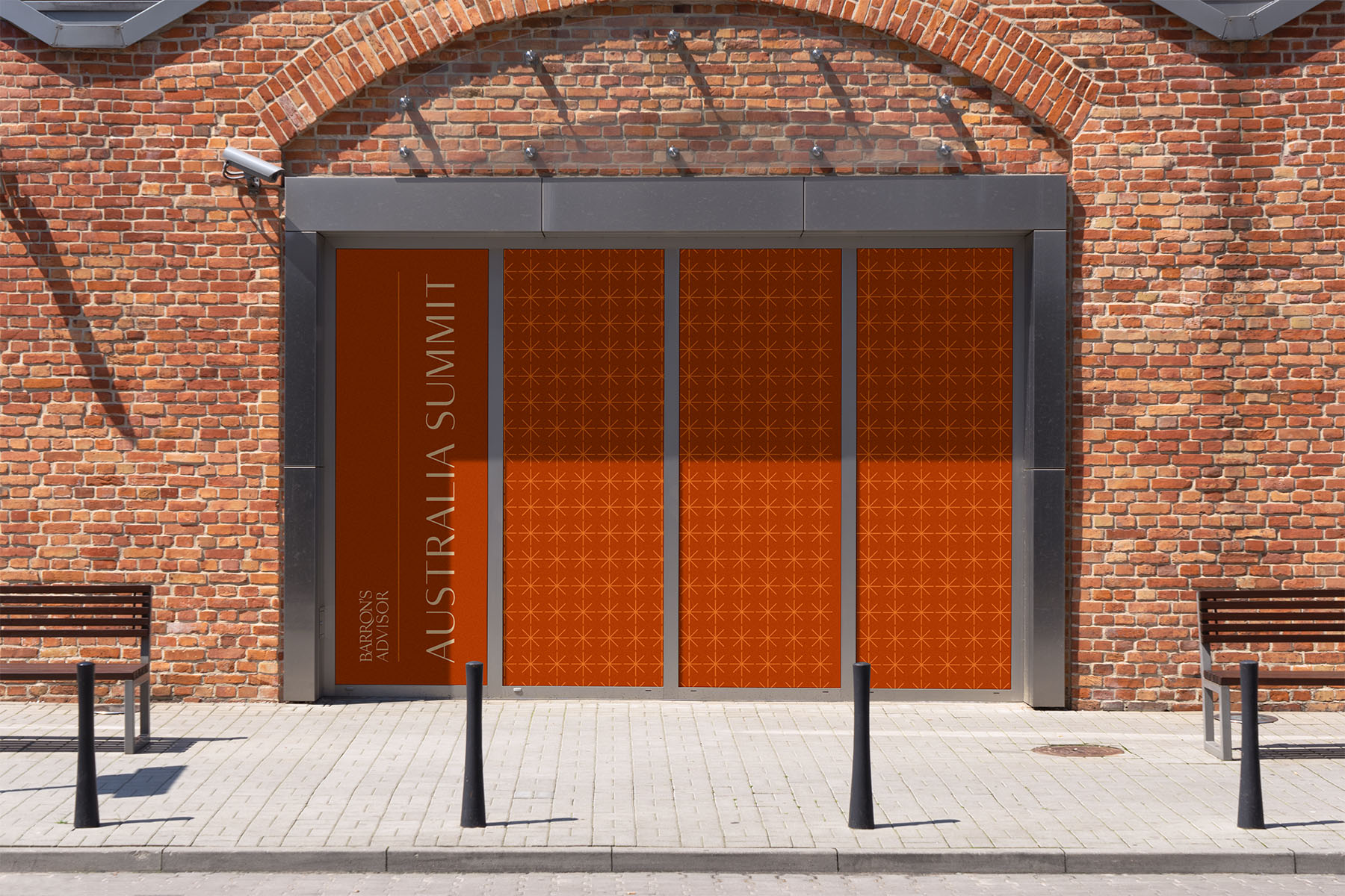
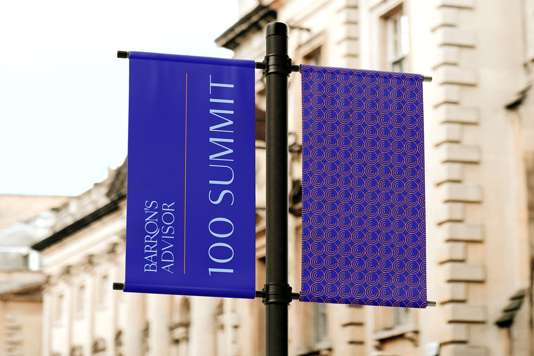
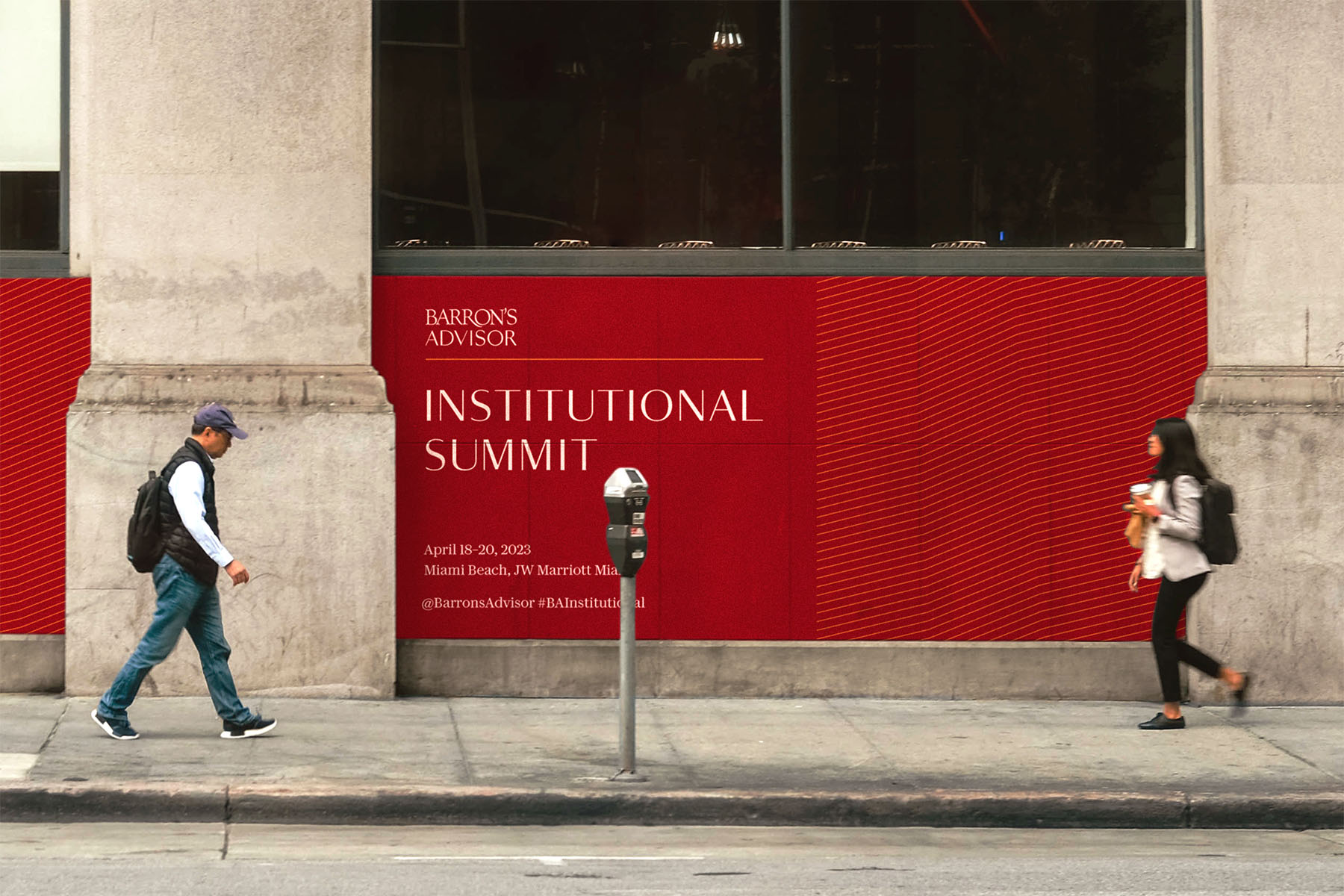
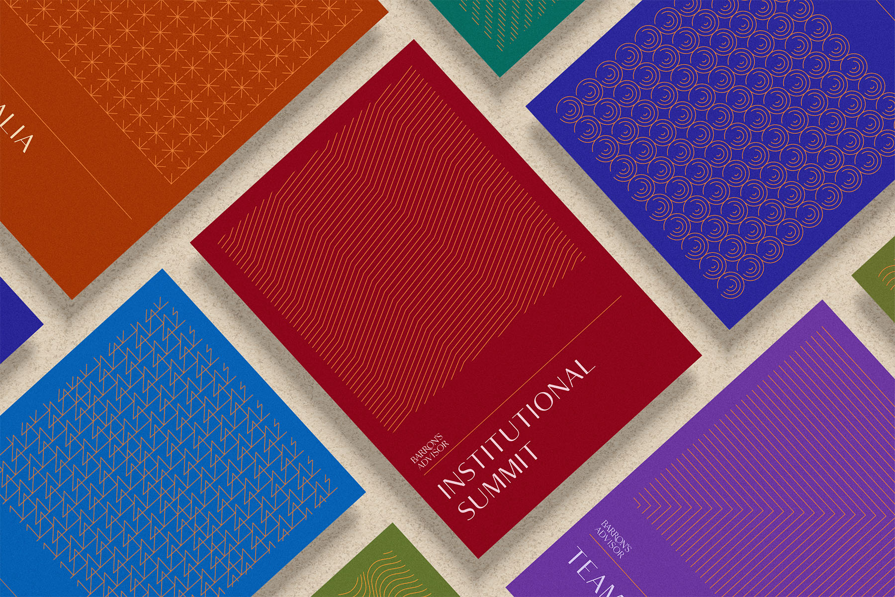
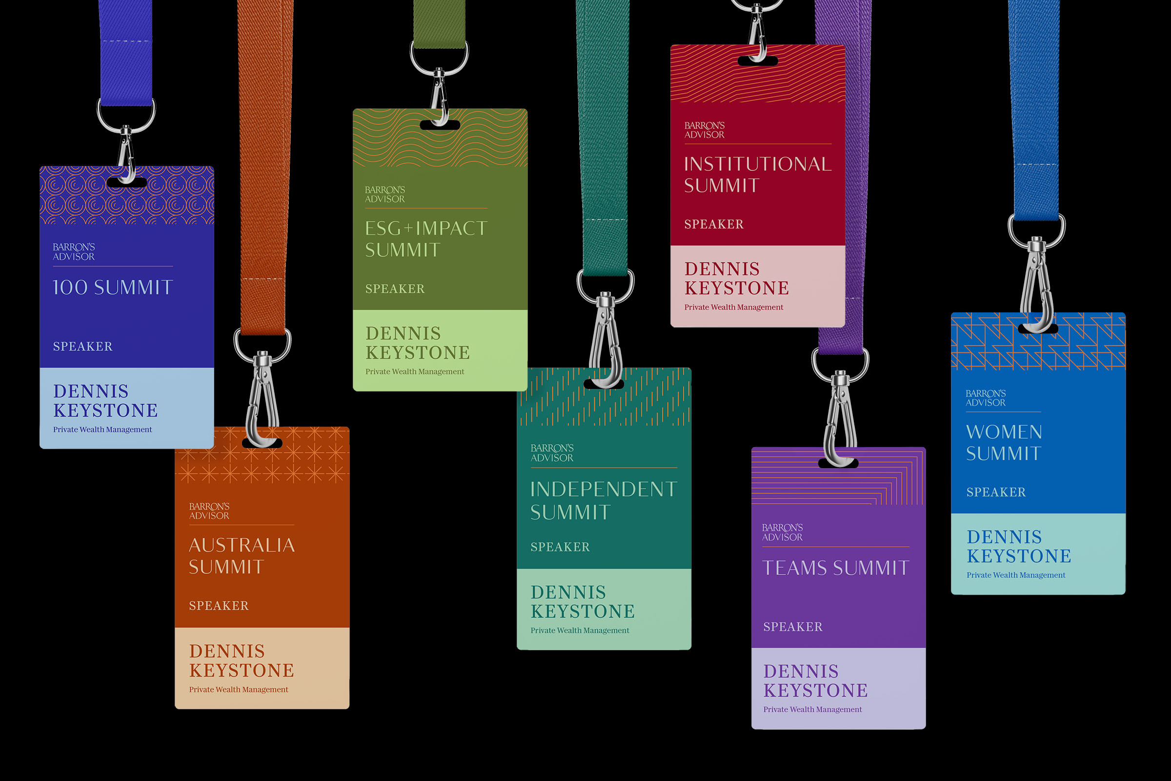
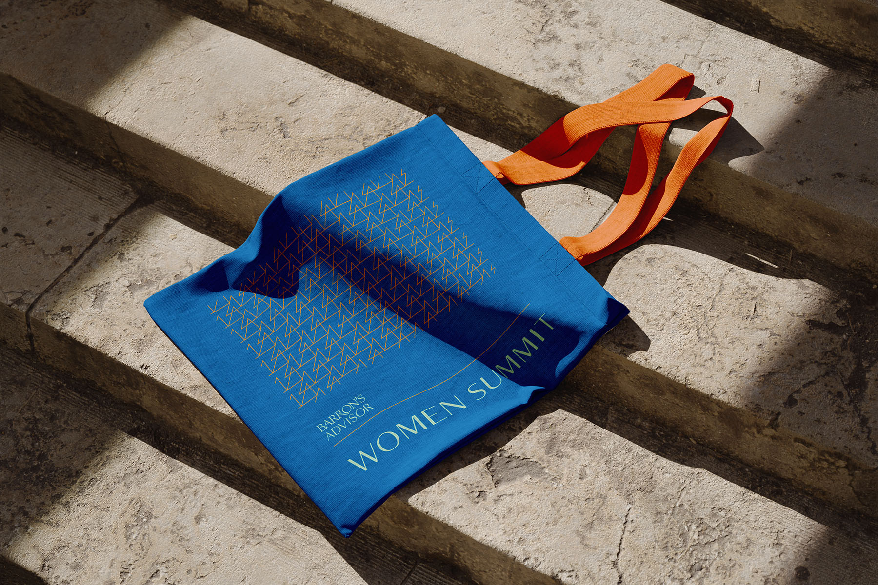
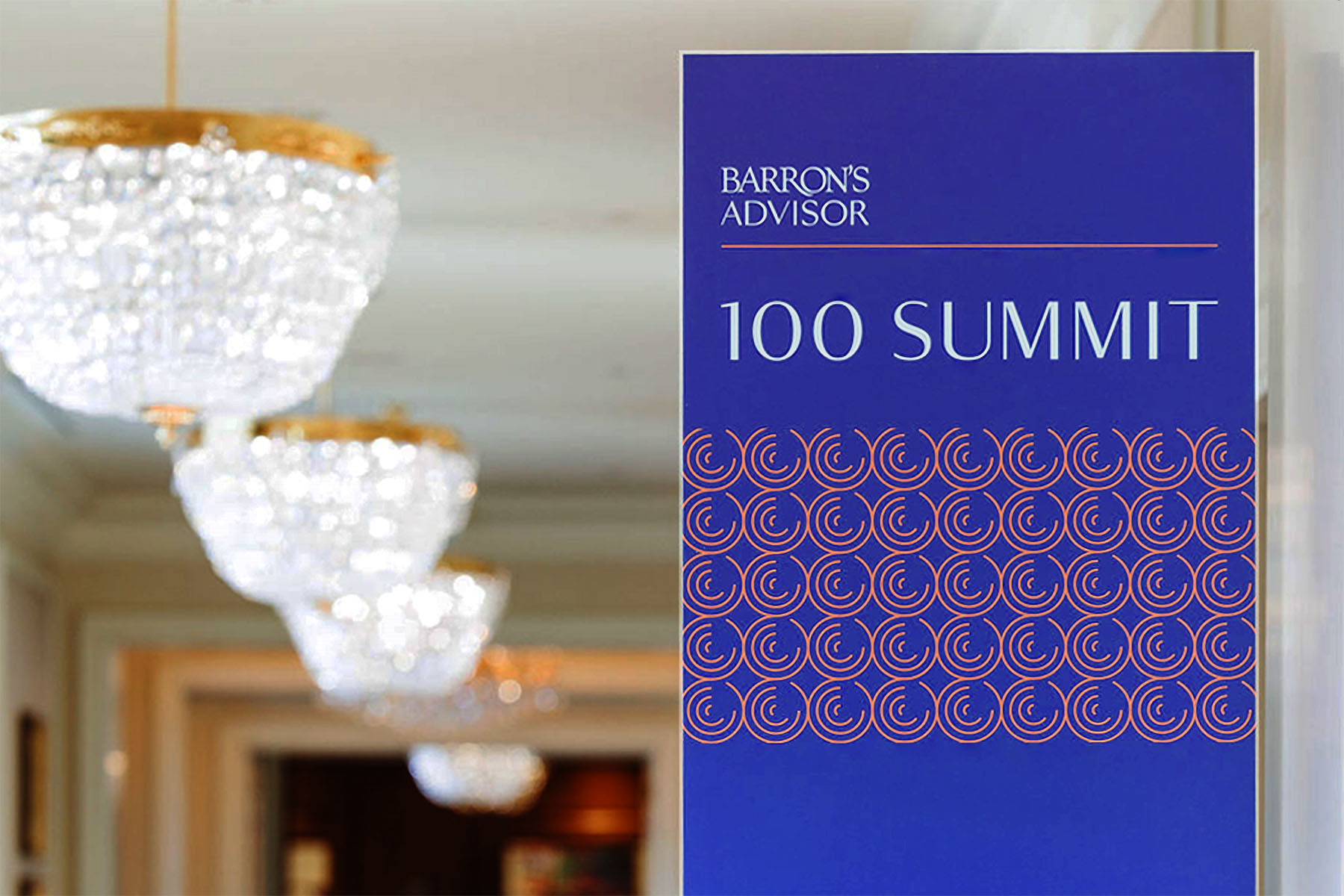
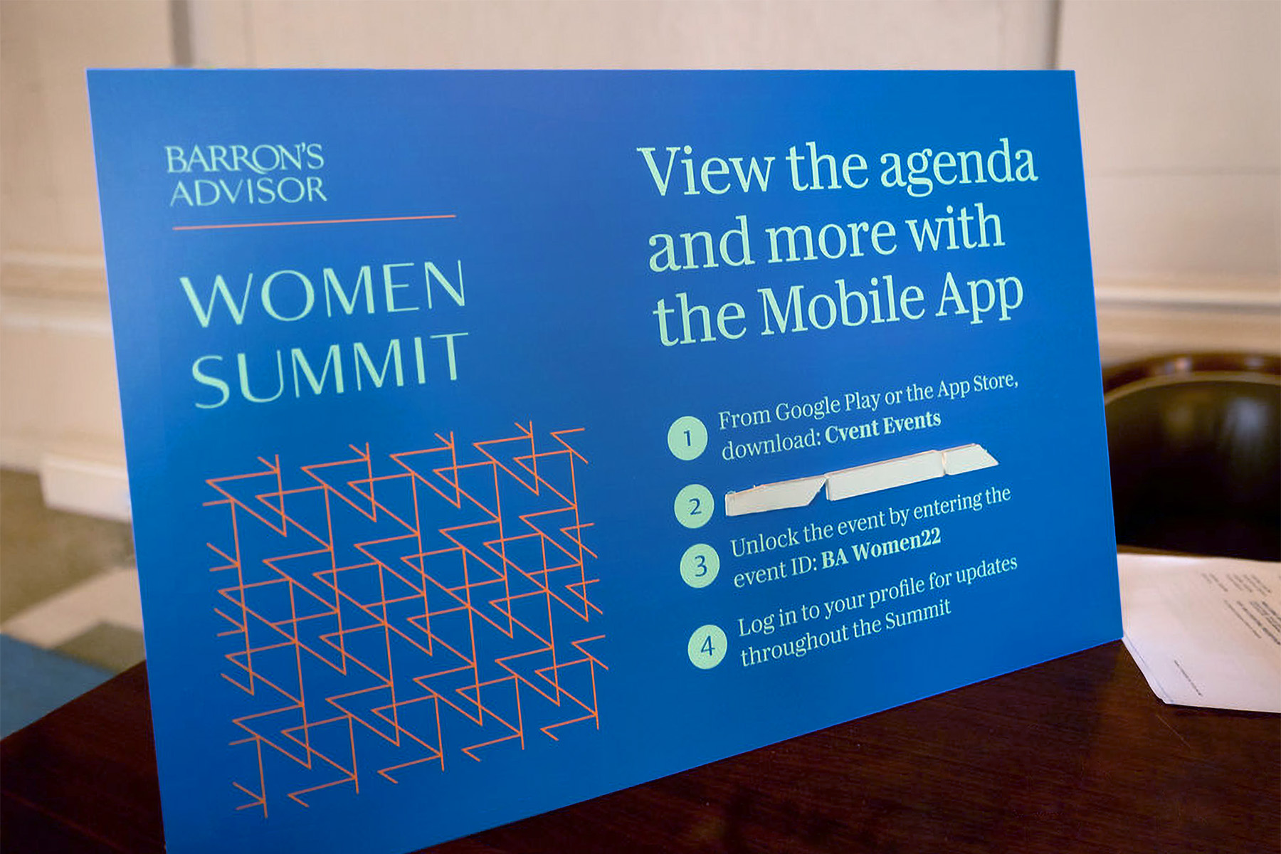
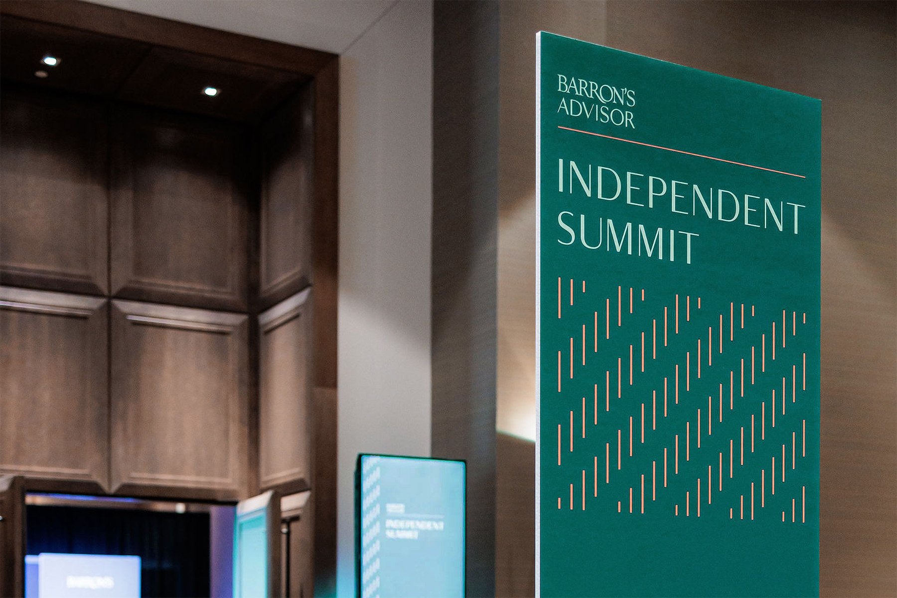
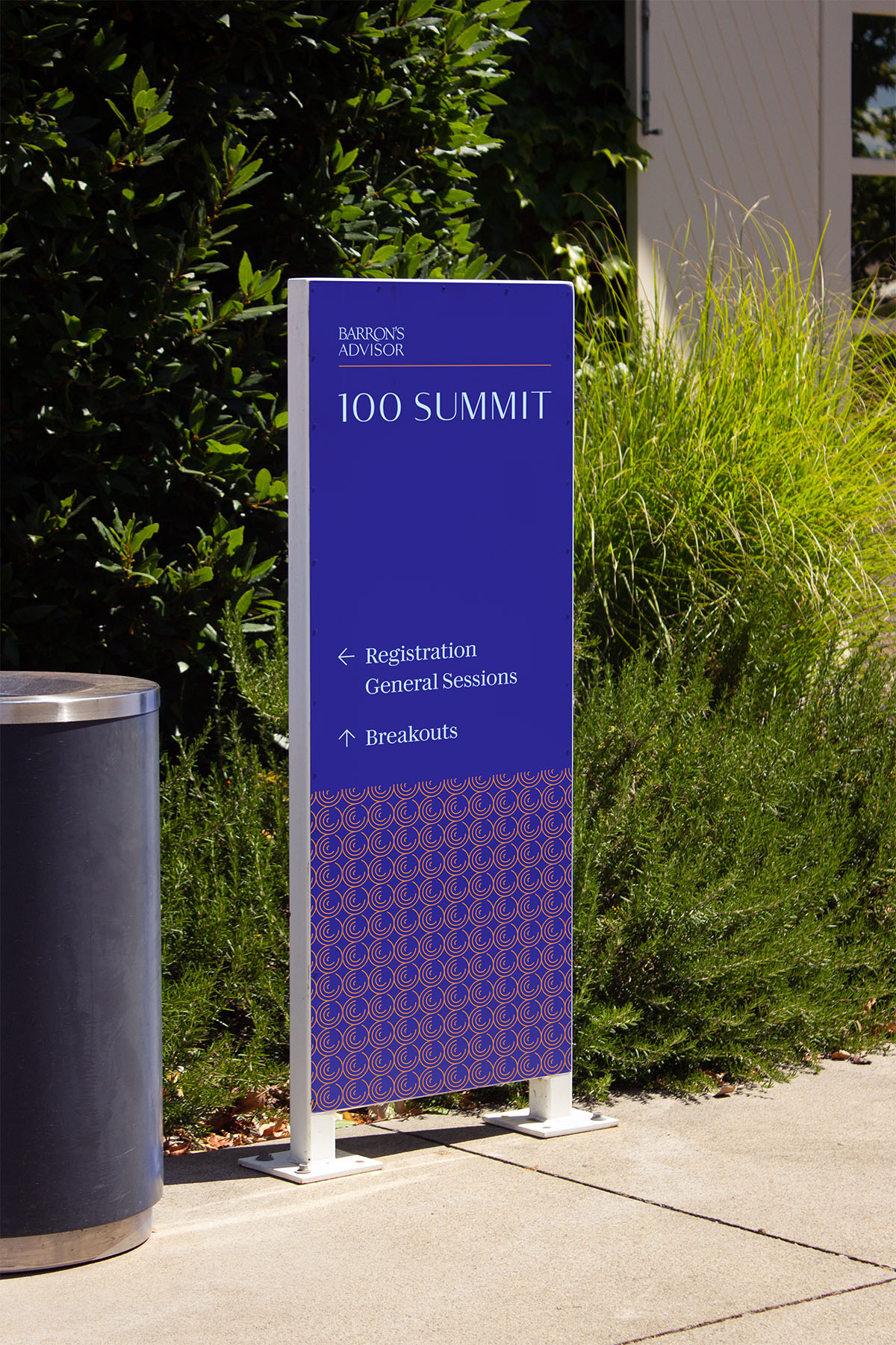
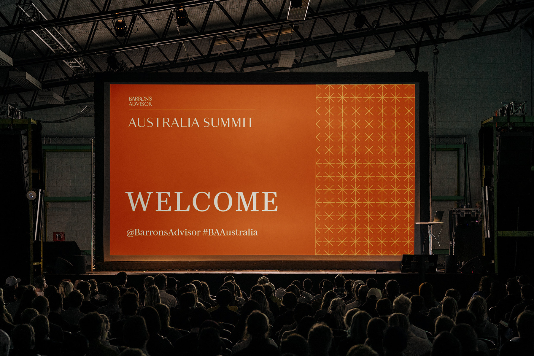
Previously designed as one-offs, the conferences now use consistent naming and share design systems with a full suite of typography by Commercial Type. Deep, saturated color palettes expand on Barron’s design heritage and stand out across both digital and physical touchpoints. Abstract but distinctive graphic patterns, derived from the orange underline in the existing Barron’s Advisor logo, are evocative of data graphs and ornamental guillochés, adding visual interest and engaging detail.
The new brand architecture builds on and amplifies the existing Barron’s Advisor brand. Visual identities, implemented by the in-house team, add continuity and consistency across marketing, attendee experience, and conference environments for all events in the series. While applications in the project scope focus on the seven Summits that already exist, the system is able to accommodate any number of new conferences, with a design toolkit that aids in production of logotypes and other visual assets.
Event photography: LILA PHOTO, courtesy of Barron’s Advisor